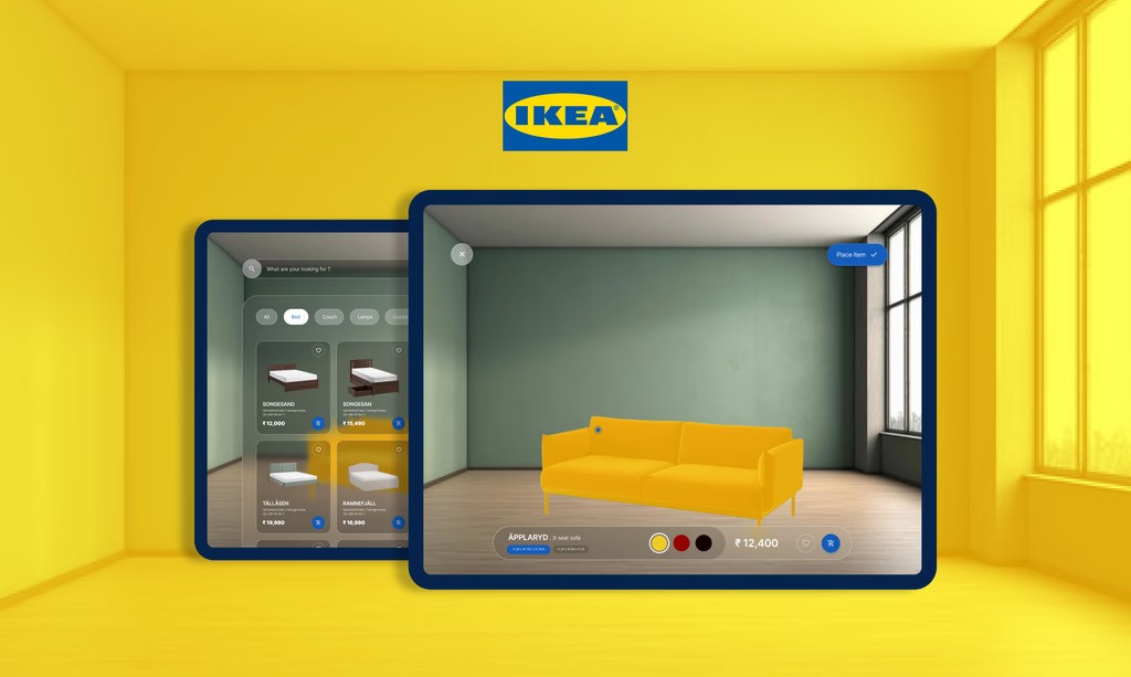
Ikea AR Experience
Ikea AR Experience
Ikea AR Experience
Ikea AR Experience
An AR-focused Ikea Kreative redesign enhancing user experience, enabling seamless, intuitive real-world furniture visualization and customization.
An AR-focused Ikea Kreative redesign enhancing user experience, enabling seamless, intuitive real-world furniture visualization and customization.
Catagory
academic project
Team Composition
Solo
my role
ux research and design
duration
2 Weeks
objective
The goal is to improve IKEA’s AR shopping experience to make it more accessible and user-friendly. The app does not cater to the diverse needs of users: seniors, families, students, and young professionals. Issues with navigation, AR visualization, and app performance. Lack of personalization and modular options for small spaces.
understanding ikea kreative
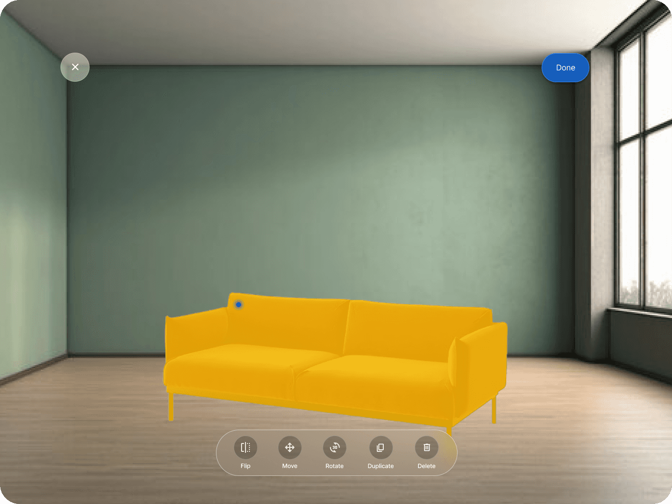
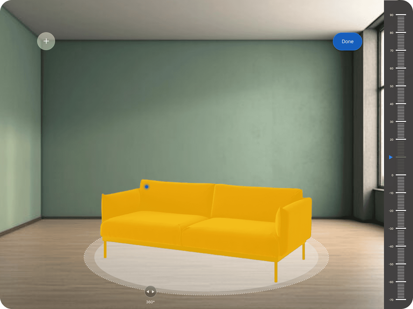
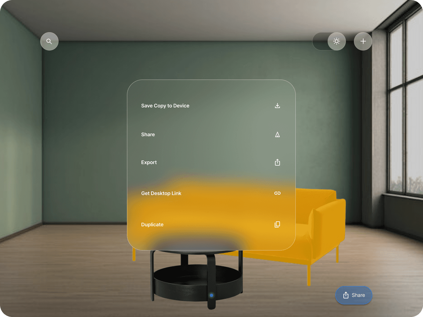
Users can explore over 50 pre-designed 3D showrooms, customizing them by adding, removing, or rearranging IKEA products. The IKEA Kreativ Scene Scanner™ allows users to capture images of their own spaces, creating interactive replicas where they can virtually remove existing furniture and redesign the area with IKEA products. It targets users of all ages, including seniors, families, students, and young professionals, helping them visualize and decide on furniture in a more personalized, interactive way
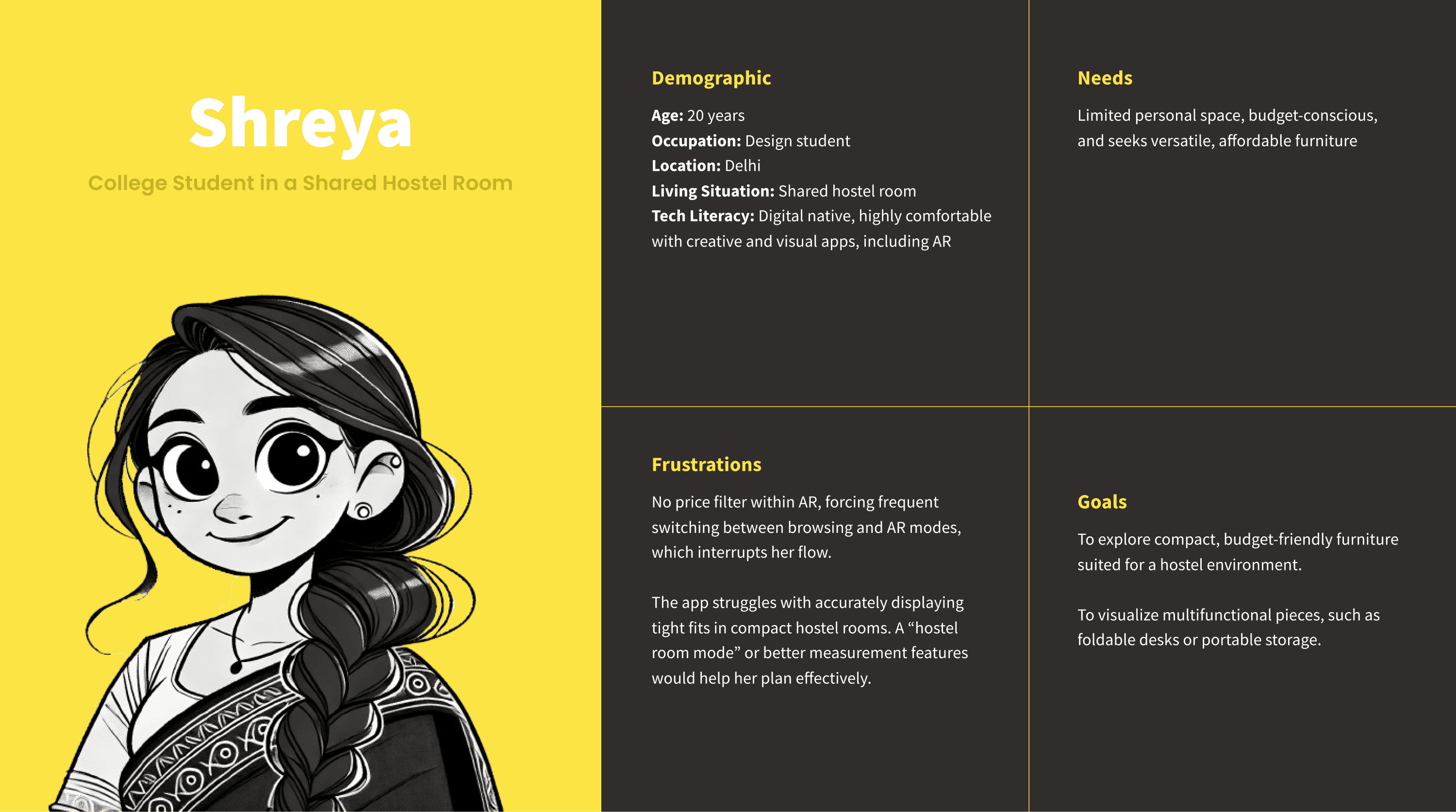
user groups
Seniors: Need easy-to-use, larger interface elements and simplified navigation.
Families: Require tools to visualize multiple pieces of furniture and make collaborative decisions.
Students/Young Professionals: Prefer modular, space-saving furniture options for smaller living spaces with quick and intuitive workflows.
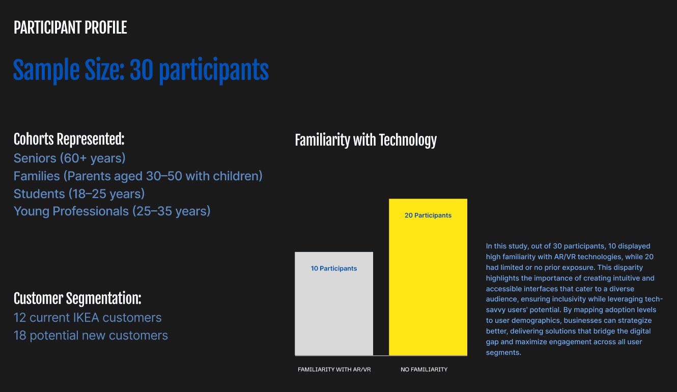
user testing
The user testing analysis for the new designs (n=30) revealed significant improvements in both task completion and user satisfaction following optimizations.
Key Improvements:
Task Completion Rates:
Room Setup: 65% → 92% (+27%)
Product Placement: 70% → 88% (+18%)
Design Customization: 55% → 85% (+30%)
Key Factors: AI assistance, smart features like snap-to-wall, gesture controls, and style suggestions.
Time-on-Task Reductions:
Room Scanning: 8.5 → 4.2 minutes (-51%)
Product Selection: 12.3 → 7.8 minutes (-37%)
User Satisfaction:
Overall Experience: 3.2 → 4.4/5 (+37.5%)
AI Features: 4.6/5, Navigation: 4.3/5, Visualization Tools: 4.5/5
Features like AR walk-throughs and style matching were particularly praised.
Segment Analysis:
Beginners: 45% → 82% success rate; valued guided scanning.
Intermediate Users: 70% → 90% success rate; valued style mixer.
Advanced Users: 85% → 95% success rate; valued professional tools.
Resolved Pain Points:
Room scanning issues dropped from 75% to 15%.
Product placement issues reduced from 65% to 20%.
Design visualization issues decreased from 70% to 25%.
Business Impact:
Increased user behavior metrics: time spent (+45%), saved designs (+65%), shared designs (+80%), and purchase completions (+35%).
Improved retention: return users (+40%), feature adoption (+55%), and positive reviews (+70%).
Recommendations:
Short-term: Expand room templates, optimize performance, and add more customization options.
Long-term: Introduce advanced collaboration features, more professional tools, and enhance social sharing.
a story of individuality and standing out
In all of these creatives, the logo becomes the focal point, floating in spaces or contrasted against similar graphical shapes that convey conformity and balance. This intentional isolation speaks to the essence of Design Pod: a space that nurtures bold ideas and allows creativity to stand out, separate from the noise of the world.
A network of independent thinkers
Design Pod has become a gathering place for like-minded, forward-thinking companies that value creativity and innovation. The podcasts featuring individuals from these organizations, though diverse in their industries, share a commitment to breaking boundaries and redefining what’s possible. They embody the same principles of independence and originality that Design Pod champions, contributing to an environment where ideas can emerge and stand apart from the crowd. For more information check out: https://iitj.ac.in/school-of-design/the-design-pod.php
Catagory
Academic Project
Team Composition
Solo
my role
UX Research and Design
duration
2 Days
Objective
The goal is to improve IKEA’s AR shopping experience to make it more accessible and user-friendly. The app does not cater to the diverse needs of users: seniors, families, students, and young professionals. Issues with navigation, AR visualization, and app performance. Lack of personalization and modular options for small spaces.
understaning ikea kreative
Users can explore over 50 pre-designed 3D showrooms, customizing them by adding, removing, or rearranging IKEA products. The IKEA Kreativ Scene Scanner™ allows users to capture images of their own spaces, creating interactive replicas where they can virtually remove existing furniture and redesign the area with IKEA products. It targets users of all ages, including seniors, families, students, and young professionals, helping them visualize and decide on furniture in a more personalized, interactive way

data collection method
Interviews: One-on-one, semi-structured interviews were conducted with to gather in-depth perspectives on their experiences and challenges with IKEA's digital tools.
Observation: Participants were observed interacting with the IKEA app and AR/VR features in a controlled setting to identify usability bottlenecks and natural interaction patterns.
User Testing: Participants explored AR-based room setups, while their responses and navigation patterns were recorded to assess ease of use and engagement.
Focus Groups: Small group discussions facilitated cross-user interaction and dialogue, revealing collective opinions, unmet needs, and potential improvement areas.
User Groups
Seniors: Need easy-to-use, larger interface elements and simplified navigation.
Families: Require tools to visualize multiple pieces of furniture and make collaborative decisions.
Students/Young Professionals: Prefer modular, space-saving furniture options for smaller living spaces with quick and intuitive workflows.
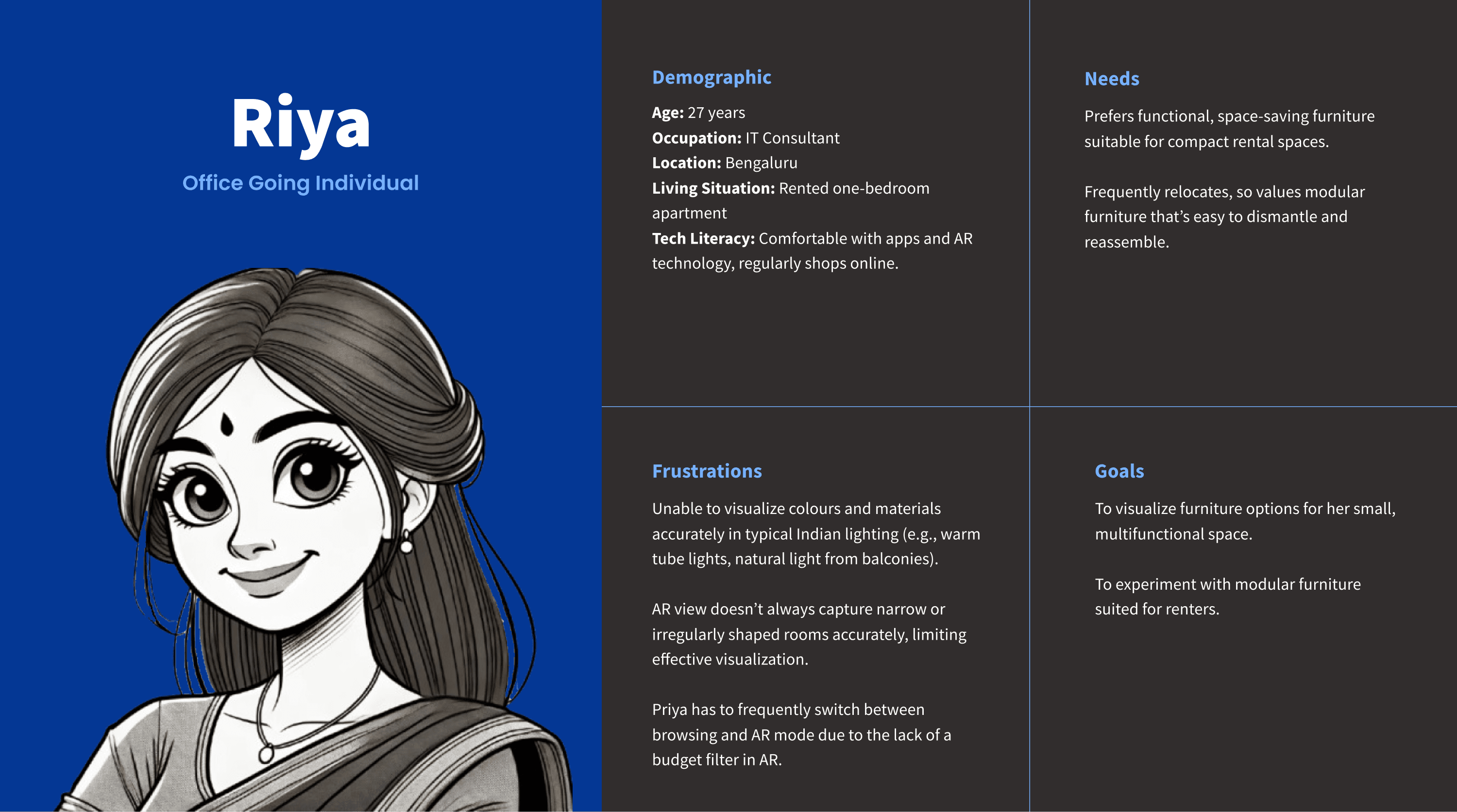
user persona
analyzing the existing screens
Data Collection Methodologies
Interviews: One-on-one, semi-structured interviews were conducted with to gather in-depth perspectives on their experiences and challenges with IKEA's digital tools.
Observation: Participants were observed interacting with the IKEA app and AR/VR features in a controlled setting to identify usability bottlenecks and natural interaction patterns.
User Testing: Participants explored AR-based room setups, while their responses and navigation patterns were recorded to assess ease of use and engagement.
Focus Groups: Small group discussions facilitated cross-user interaction and dialogue, revealing collective opinions, unmet needs, and potential improvement areas.
Identifying Gaps in User Flows : Pain Points
Issues Discovered
User Persona
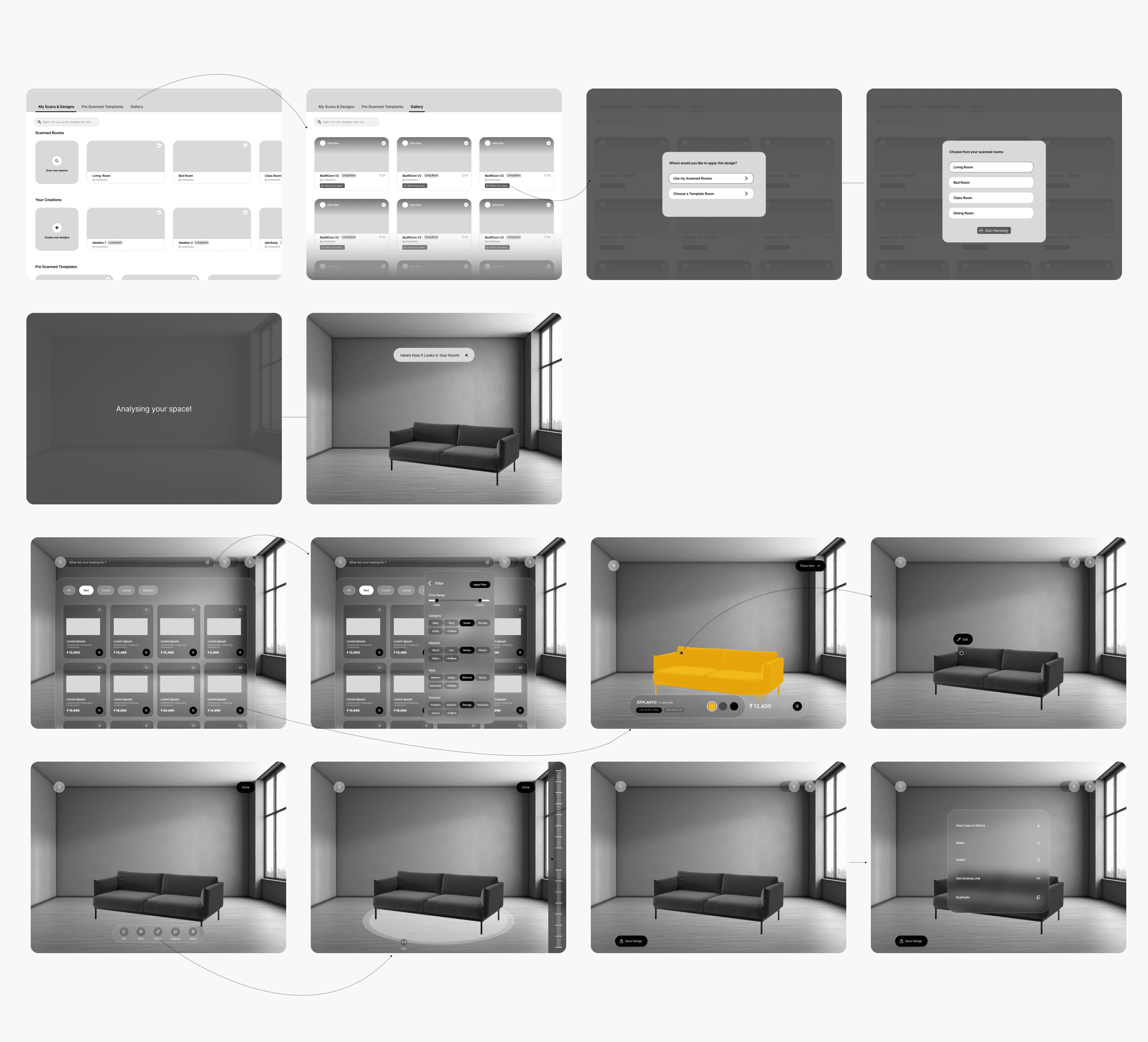
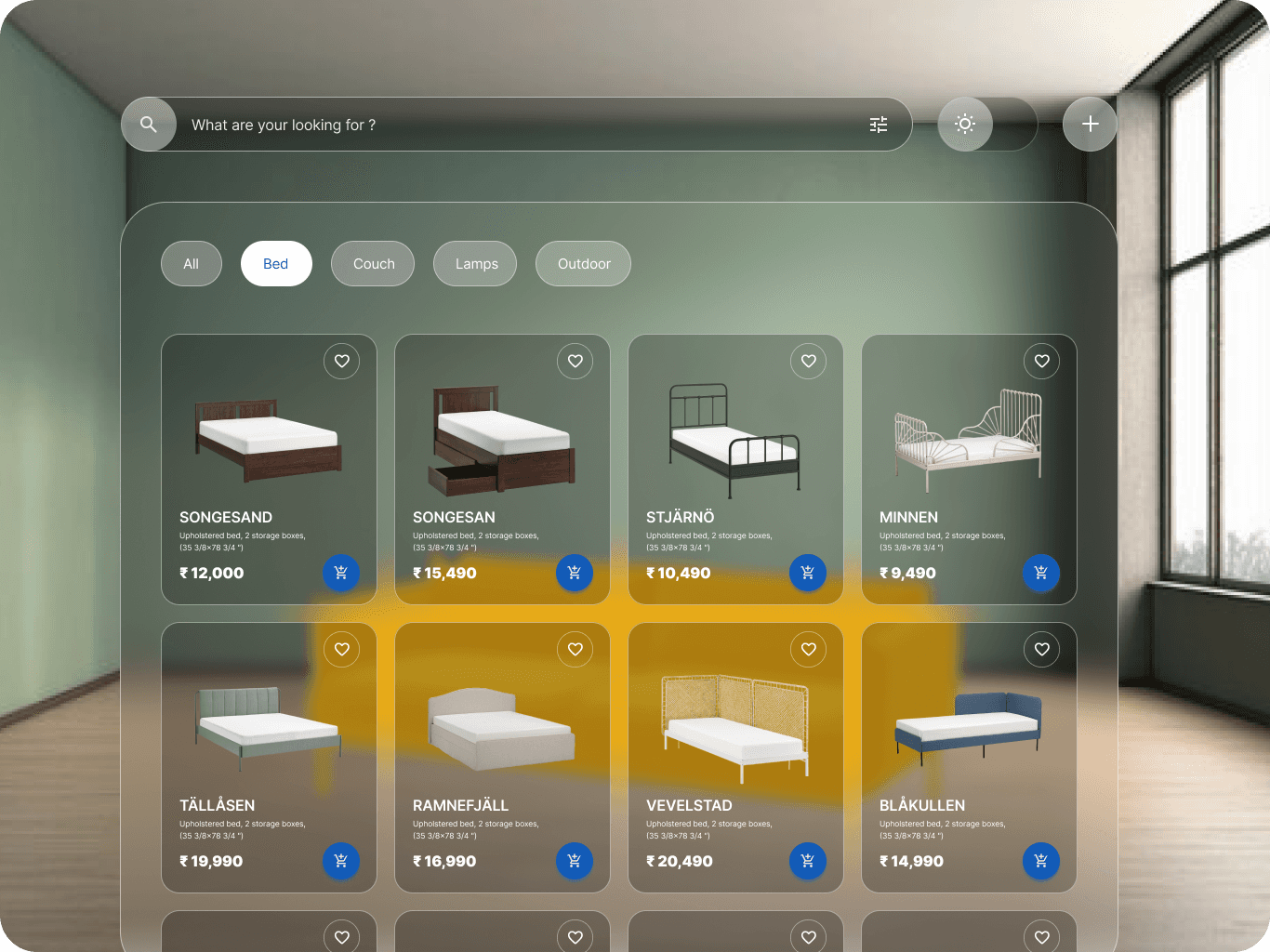
optimized task flow
key ux improvements
1. Cognitive Load Reduction
Updates: Pre-scan assessments and smart placement suggestions.
Foundational Principles: Reducing mental effort by leveraging the concept of cognitive limits (7±2 items in working memory) and prioritizing recognition over recall to streamline decision-making.
Results: Simplifies room setup, minimizes decision fatigue, and boosts task completion rates.
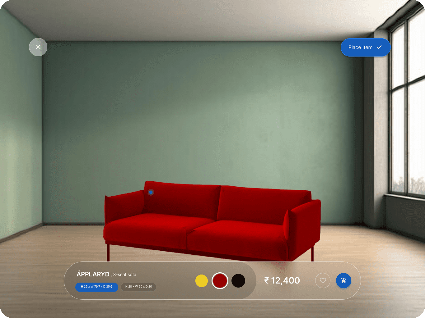
2. User Control & Freedom
Updates: Multi-scan merging, version history, collaborative editing, and professional measurement imports.
Foundational Principles: Built around user autonomy and error recovery, inspired by Norman’s design principles and Shneiderman’s focus on direct manipulation for control and efficiency.
Results: Encourages freedom, seamless workflows, and professional-level precision.
3. Feedback & Visibility
Updates: Real-time scanning feedback, assembly difficulty previews, installation space verification, and lighting simulations.
Foundational Principles: Ensures clarity and user confidence by focusing on feedback loops and making system states highly visible.
Results: Reduces uncertainty, enables informed decision-making, and fosters trust.
4. Natural Mapping
Updates: Gesture-based controls, smart snap-to-wall functionality, traffic flow analysis, and AR walk-through mode.
Foundational Principles: Enhances intuitiveness using spatial memory, embodied interaction, and natural mapping for real-world correlations.
Results: Lowers the learning curve and improves spatial comprehension.
Some organizations design pod has featured


wireframes
final screens
Analyzing the Existing Screens

Identifying Gaps in User Flows : Pain Points

issues discovered

Optimized Task Flow

Key UX Improvements
1. Cognitive Load Reduction
Updates: Pre-scan assessments and smart placement suggestions.
Foundational Principles: Reducing mental effort by leveraging the concept of cognitive limits (7±2 items in working memory) and prioritizing recognition over recall to streamline decision-making.
Results: Simplifies room setup, minimizes decision fatigue, and boosts task completion rates.
2. User Control & Freedom
Updates: Multi-scan merging, version history, collaborative editing, and professional measurement imports.
Foundational Principles: Built around user autonomy and error recovery, inspired by Norman’s design principles and Shneiderman’s focus on direct manipulation for control and efficiency.
Results: Encourages freedom, seamless workflows, and professional-level precision.
3. Feedback & Visibility
Updates: Real-time scanning feedback, assembly difficulty previews, installation space verification, and lighting simulations.
Foundational Principles: Ensures clarity and user confidence by focusing on feedback loops and making system states highly visible.
Results: Reduces uncertainty, enables informed decision-making, and fosters trust.
4. Natural Mapping
Updates: Gesture-based controls, smart snap-to-wall functionality, traffic flow analysis, and AR walk-through mode.
Foundational Principles: Enhances intuitiveness using spatial memory, embodied interaction, and natural mapping for real-world correlations.
Results: Lowers the learning curve and improves spatial comprehension.
Wireframes
final screens


User Testing
The user testing analysis for the new designs (n=30) revealed significant improvements in both task completion and user satisfaction following optimizations.
Key Improvements:
Task Completion Rates:
Room Setup: 65% → 92% (+27%)
Product Placement: 70% → 88% (+18%)
Design Customization: 55% → 85% (+30%)
Key Factors: AI assistance, smart features like snap-to-wall, gesture controls, and style suggestions.
Time-on-Task Reductions:
Room Scanning: 8.5 → 4.2 minutes (-51%)
Product Selection: 12.3 → 7.8 minutes (-37%)
User Satisfaction:
Overall Experience: 3.2 → 4.4/5 (+37.5%)
AI Features: 4.6/5, Navigation: 4.3/5, Visualization Tools: 4.5/5
Features like AR walk-throughs and style matching were particularly praised.
Segment Analysis:
Beginners: 45% → 82% success rate; valued guided scanning.
Intermediate Users: 70% → 90% success rate; valued style mixer.
Advanced Users: 85% → 95% success rate; valued professional tools.
Resolved Pain Points:
Room scanning issues dropped from 75% to 15%.
Product placement issues reduced from 65% to 20%.
Design visualization issues decreased from 70% to 25%.
Business Impact:
Increased user behavior metrics: time spent (+45%), saved designs (+65%), shared designs (+80%), and purchase completions (+35%).
Improved retention: return users (+40%), feature adoption (+55%), and positive reviews (+70%).
Recommendations:
Short-term: Expand room templates, optimize performance, and add more customization options.
Long-term: Introduce advanced collaboration features, more professional tools, and enhance social sharing.
Catagory
Branding
Team Composition
Solo
my role
branding
duration
2 Weeks
Introduction
Design Pod was created to provide a platform where creative minds could come together to explore, innovate, and push the boundaries of design and technology. This space is a hub of collaboration and imagination, where visionary designers, artists, and developers can bring their ideas to life. The branding assets reflect this ethos, combining elements of creativity, energy, and professionalism. The logo, color palette, typography, and visual elements are all crafted to evoke a sense of modernity and forward-thinking while remaining grounded in simplicity and clarity.
brand and story - the vision
Design Pod’s core vision is to foster a community that nurtures creativity and supports innovative ideas. It was designed as a space for design enthusiasts and professionals to come together, collaborate, and create something exceptional. The branding elements—each carefully selected and crafted—help to communicate this vision both in physical spaces and online platforms. The logo itself is symbolic of the "pod," representing a small, contained environment that nurtures big ideas. The sharp, clean lines convey professionalism, while the colors and visual elements hint at energy, creativity, and innovation.